The COVID Radar app is citizen science at its best. More than 200,000 users in the Netherlands are answering questions about their health and behavior to help predict the development of the pandemic. Niels Chavannes, Professor of General Practice at Leiden University Medical Center, explains how the app—a Leiden’ invention—works.
How did the COVID Radar come about?
At the beginning of the first wave, the testing capacity was still very low, and we saw that behavior, such as keeping a safe distance, was an important predictor of the number of infections. Researchers from the LUMC and the Population Health Management degree program then invented the COVID Radar (in Dutch) app. In collaboration with the IT company Ortec, they built a very easy-to-use app that maps out both the symptoms of COVID-19 and the associated behavior. We immediately attracted a lot of users and still have more than 200,000 across the country who collectively already have answered six million questionnaires.
What is the difference between this app and the government’s CoronaMelder app?
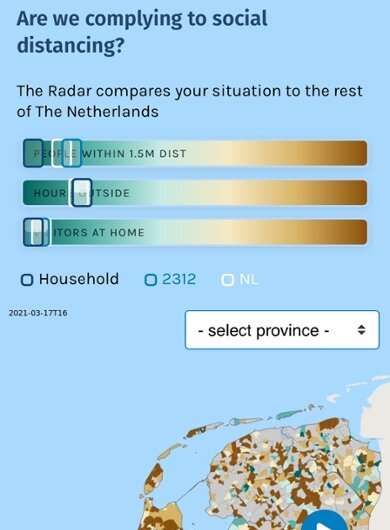
CoronaMelder only registers if you have tested positive yourself and gives a warning if you have been in the vicinity of infected people. COVID Radar doesn’t do that. Users of our app complete a short questionnaire about twice a week about whether they have tested positive or have experienced coronavirus-related symptoms such as cold symptoms or a loss of smell and taste. In addition, they answer questions about their behavior: have you been in crowded places? Have you spent time within a meter and a half of people? It takes about 30 seconds; the questions are already answered by default and you just have to click the slider. Answering the questions is not compulsory, but the app gives you a friendly reminder if you haven’t completed it yet.
What does it deliver?
It’s a sample that is particularly reliable in the Randstad because there are many users of the app in that area. The information from all those people together has an important predictive value. A week before there is an increase in confirmed infections, we see an increase in symptoms and a change in behavior. People indicate that they are less compliant with the rules, such as keeping their distance and wearing masks. We saw that very clearly in the summer. A few weeks later, the number of infections increased rapidly. For example, we saw that the areas with a lot of students turned red and, when there was more lax behavior, the reported symptoms increased afterwards.
What about privacy?
That’s not at risk; we looked at that carefully. COVID Radar collects data by postcode area. That means that as an individual user, you are part of a group of 3,000 people in the same postcode area and you are not identified personally. The only personal data the app collects are age, gender and whether people work in healthcare, because that carries a higher risk of infection. The Dutch Data Protection Authority, which keeps a very close eye on privacy risks, granted permission in April 2020 and the app has been up and running ever since.
Do you have any idea whether the users actually answer the questionnaire honestly?
We realize that not all participants will answer everything truthfully, but we do think that the users are a bit more the benevolent citizens from the population: they are motivated to participate because they want to give researchers greater insight for fighting the pandemic. Users don’t get individual feedback about the questions, and they don’t have to worry about us checking to see whether they’re getting tested, for example, because we don’t do that kind of thing. By the way, the fill-in rate increases a lot as another wave arrives because people suddenly see their neighbor being taken away by ambulance or have an aunt in intensive care.
What is being done with the findings?
It’s citizen science and open science. Users can look at a newsfeed in the app to see how the pandemic is developing and, for example, can view graphs about their own postcode area. Users appreciate being kept up to date by a scientific team. Older users in particular say that they feel less lost as a result, especially if they are isolated at home.
We also make the data available to officials. For instance, the mayor of Leiden already has been pleased to use it because we can look by neighborhood to see where things are getting out of hand. The results are also going to the National Institute for Public Health and the Environment (RIVM) and the Ministry of Health, Welfare and Sport, and we hope that they will make even better use of the information. A grant application is now pending to link this data to mobility data such as traffic flows. That will make it possible to predict more accurately where new hotspots will occur. European partners can also use the data to carry out comparative studies, and our first publications have now been submitted to scientific journals.
The end of the pandemic is hopefully in sight as the number of vaccinated people increases. What does that mean for the future of the app?
Source: Read Full Article
